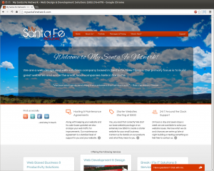
My Santa Fe Network: A Website Re-Design
Categories: News, System Updates
 Over the past few weeks I’ve taken on an initiative to refine the design of My Santa Fe Network. The previous design was nice (in a we rushed it kind of way) but it needed some attention and I wanted to make an emphasis on Responsive Design.
Although the new design is similar in ways to the previous website it’s also very different in function. I spent a lot of time on details. I wanted to keep the big Santa Fe scenic visuals on the home page header but also allow content to take precedence when needed.
It’s Responsive!

The latest initiative in web design is to create designs that respond to the size of your users device screen (mobile or tablet) or browser window (computer). About 23% of visitors are on mobile devices and this much of the market cannot be ignored. This doesn’t mean mobile devices cannot reach your website, it just makes browsing your website a lot more convenient without your visitors having to zoom in and out of content.
There’s a lot to Responsive Design so I wanted to test drive responsive elements in an environment where if they didn’t work properly it didn’t affect a customers website. I’m still working out some bugs with the responsive elements (vertical tablets) but those will be ironed out in time.
Visitor Engagement
I’m testing out other ways to get visitor engagement and one of those ways is a on-page chat functionality where prospective clients can ask questions and give feedback if they feel inclined.
Overall I’m very happy with the design but I gotta get back to the real work. Feel free to browse around. If your a previous client of mine please feel free to contact me about implementing responsive elements into your website. There are some very low cost alternatives to having to totally rebuild your website and some websites naturally lend themselves to responsive design.

No comments yet.